Hartmut Jatzke-Wigand
Brionvega Part 1
'La tecnica nella sua forma piu bella'
"'Technology in its best form' - achieved by an extensive integration of the highest technological level as well as a convincing design" - this was how the Italian Brionvega S.p.A. summed up the achievements of their work 1). This statement regarding the Brionvega products which are exemplary for Italian design will be the leading idea for the following articles 2). Basic questions in this article were: Which of the audio-visual Brionvega S.p.A. products show an exemplary design 3)? Which design principles were persued by Marco Zanuso (fig. 5), Richard Sapper (fig. 5), Achille and Pier Giacomo Castiglioni (fig. 9) and Ettore Sottsass (fig. 20), all of them internationally renowned designers. What are the significant differences compared to products of the Braun AG who have been trendsetter in German industrial design 4)?
Brionvega S.p.A. - a historical review (1)
In 1945, Guiseppe Brion, together with Leone Paietta and Onorina Tomasin founded BPM (Brion, Paietta, Milano). This company developed and produced radio sets; from 1952 onwards, they experimented with audiovisual electronics. BPM turned into VEGA RADIO TELEVISIONE 5). During the 50ies design-orientated companies as e.g. Olivetti 6), Kartell 7) and Arflex 8) discovered market gaps. Their thoroughly designed products, for example the 'Lettera 22' by Marcello Nizzoli (1950), founded the international reputation of Italian design.
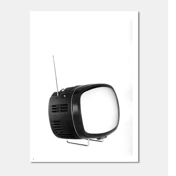
The thorough, formal designing of technological objects and the increasing significance for marketing purposes was rapidly recognized by Giuseppe Brion. According to Marco Zanuso, Brion was interested in culture and had the ability to understand formal and creative processes 9). For this reason, Brionvega S.p.A. commissioned Marco Zanuso in 1960 to formally revise their television sets (' Antares' and 'Yades') and immediately afterwards to come up with a new concept for the compact TV set 'doney 14"', based on
the innovative transistor technology (fig. 1). The 'doney 14'" as well as the subsequent set 'algol 11"' set intrinsic value standards by combining technological and formal aspects (fig. 2). Their exemplary sets made Brionvega S. p.A. more than just well-known; they became famous 10). Since 1962, Brionvega S.p.A. has belonged to the small to medium-sized companies of the Italian industry. Their high-tech products and their unconventional formal concept merged to solve technical problems 11). They were also an important factor for Italy's economical boom.
Designers (1): Marco Zanuso and Richard Sapper
"An object that had been filtered through mass production is the result of experimental and extremely thorough planning, and this is all the more so when it must meet severe functional demands ... " (Marco Zanuso, 1988) 13). Marco Zanuso did not consider design the 'forming' of an 'exterior skin', he rather regarded design as a task to combine the context of use with the technology at hand and the structure of the set. The 'Compasso d' Oro' Award for the 'doney 14'" in1962 honoured Zanuso's design endeavours.
Marco Zanuso and his co-designer Richard Sapper were responsible for the designing of the following Brionvega TV sets: 'doney 14"' (1962), 'algol 11'" (1963/64) and 'black' (1969) as well as the portable radio set 'ts 502' (fig. 1, 2, 4 and 6). In 1961, Brionvega marketing researchers realized the significance of smali compact TV sets. During the design process, Marco Zanuso and Richard Sapper primarily analysed the three-dimensional relation of technical functional units and the exterior design. In close cooperation with technicians, they renounced the hitherto common large switch plate in favour of single functional segments - which were then arranged around a newly developed TV tube (fig. l7) 14). The volume determined by the tube's diameter was thus optimally used, all connections and operating elements were easily accessible 15). The rounded form of the plastic housing harmonized with the spherical screen. The 'doney 14"' looked elegant, the exterior was of uniform and closed appearance. The experiences gained by consequent use of the transistor technology and extremely small switches as well as the constructural details of the 'doney 14"' merged in a still more compact inner technology integrated in the 'algol 11'" (1963/64).
The screen of the portable 'algol 11"' leaned towards the user; a roller cabinet console for the set was therefore abandoned (fig. 8). The 12 V/24 V adapter can be connected separately, the design of which
harmonized with that of the TV set's. The 'algol 11'" became one of the classic Italian design objects; it is still available in constantly up-dated versions 17)18). The portable radio 'ts 502' - which is still produced in a slightly different version called 'ts 505' - first went into production in 1964 and received multiple awards - an example of the masterly design work of Marco Zanuso and Richard Sapper 19). When designing the 'ts 502' both were faced with the solving of the 'corpus' problem 20). They examined the "looks of a set which as such is constantly in one's surrounding, yet not constantly in use. Their reflections lead them to the authentic form of the best designed 'machine' and also to the form of an independent 'object' - of a set which is not used, not switched on" 21). This was also true for the TV set 'televisore 12 black st 201' (fig . 4) designed in 1969. Its screen was hardly visible behind the smoke-coloured transparent acryl pane - the 'black' looked like a polished, black rectangular object. For Marco Zanuso, the "black stands for the highest degree of abstraction, an "almost surrealistic object which alternately appears and disappears 22).
Designers (II): Achille and Pier Giacomo Castiglioni
"Function is the most important factor in the act of designing. It dominates the creative process right to the end" (Achille and Pier Giacomo Castiglioni, 1988) 23). Their major aim in designing the stereo radio receiver 'rr 126 fo/st' (1966) was to create a self-supporting and mobile set of excellent stereophonic performance (fig. 10) 24) 25). Particular attention was devoted to the space-saving positioning of the loudspeakers: they could either be fastened to the sides, placed onto the asymmetrically integrated record player or set farther away. The operating elements and scales were arranged in a clear and orderly manner. The accurate design underlined the constructive features of the roller steel console (fig. 11). The 'rr 126 fo/st' was "an indoor object with its own support making it look as if it were suspended in thin air" 26 ). The 'rr 126 fo/st' became a great marketing success and by the end of the 60ies it was a status symbol of the higher income class in Italy's major cities. In 1967, Achille and Pier Giacomo Castiglioni were commissioned with the development of a concept for a portable 'wire' radio receiver for no more than six stations e.g. for use in hospitals.
The 'fd 1101 Brionvega' was, due to the clever arrangements of technical components, a long-shaped radio set which could be squeezed in every possible space, be it horizontally or vertically, on shelves or much-used work tops (fig. 12) 27). The housing consisted of two compressed wear and tear-resistant plastic bowls (fig. 13). With this set the brothers Castiglioni proved their mastership in using plastic for mass products. The close cooperation of designers, production and processing experts ensured the success of the product and additionally helped to reduce production and assembly costs.
Designers (III): Mario Bellini
"I believe, my style cannot be recognized by means of certain features. lt rather is determined by the way a task is approached. Therefore, I have a thorough look at things in order to examine their background which may vary from case to case" (Mario Bellini, 1988) 28). In 1970, Mario Bellini designed the 'totem rr 130' stereo system (fig. 14). Its closed white and dark blue lacquered wooden cubes (510 x 510 x 520 H) appeared like a small sculpture that was concealing something (fig. 15, 16). The upper cube consists of
two mobile loudspeakers, their black loudspeaker spacings were abstract and rhythmic accents 29). Within the history of the development of the formal designing of radio sets, the 'totem rr 130' formed an extreme design solution: the design principles demanded by purely mechanical manufacturing were renounced to the same extent as the aim to comprehensively stress the self-explaining quality of the product 30). Enzo Fratelli characterized Mario Bellini's design as a "design philosophy which negates all mechanical and technological aesthetics" 31).
Another 'technlogical sculpture' by Mario Bellini (1970) was the portable TV set 'aster 20"' (fig. 17). The 'aster 20"' consisted of an elegant, accurately proportioned corpus with front and rear parts which were worked out to the last detail. Ventilation openings and spacings gave it a less compact appearance 32). At the New York 'Mario Bellini, designer' exhibition by the Museum of Modern Art, the 'astor 20"' was regarded as the most thoroughly designed Brionvega TV set 33).
With his subsequent designs Mario Bellini continued to experiment within the frames of geometrical and formal aspects. The rectangular form of the 'monitor 15"' (fig. 18) (1978) reminded of Marco Zanuso's
'black' (1969). The 'monitor 15"' was formed like a three-segmented case where the operating elements were arranged in the wider centre part (fig. 18). With its rectangular corpus-integrated handles and dominating ventilation slits, the set was supposed to inspire associations to the precision of military equipment.
With Mario Bellini's large TV set 'quadro' (1991) Brionvega attempted to resume their former successes (fig. 19). The most striking feature of the 'quadro' was the screen's large black frame which excluded all external influences 34). The loudspeakers were integrated into the frame. A small support helped to give the impression of a 'light-weight' set and "underlined its work of art character" 35). By labeling it 'work of art', the Brionvega marketing department attempted to stress the set's uniqueness. The term 'work of art' however leads us to the Sottsass Associati design work for Brionvega.
Designers (IV): Ettore Sottsass
"For me design is an anthropological cultural gesture. There is more than just one design. ( ... ) Memphis believed that design must develop in the one direction, obviously determined by history. Yet I believe other illustrative and behavouristic patterns have to be found" (Ettore Sottsass, 1988) 36). In 1980/81 Ettore Sottsass together with Matteo Thun and Marco Susani (Sottsass Associati) were responsible for the formal design of four different colour TV sets planned as prototypes for Brionvega S.p.A. (fig. 21). Exactly 15 units were produced of only one of these prototypes - the colour TV 'Memphis l' (1981) with a abet-print-laminate coated housing (fig. 22) 38)39). This extremely low production rate together with the price (2.500.000 lira) turned the ' Memphis 1' TV set into yet another work of art. If enswed the identification of a very small group with the 'Memphis Design' and with Brionvega S.p.A..
Brionvega S.p.A. - a historical context (II)
The 1960ies proved the most creative and interesting years both for Italian industry and Italian design history 40). In close cooperation with each other technicians and designers experimented with plastic, used technological novelties and found new formal design solutions in the audio-visual sector. The ltalian branch of the American agency unimark reduced Brionvega advertisements to a recognisable unity - e.g. operating manuals, brochures for Brionvega products and inscriptions (fig. 23 and 24). Tobia Scarpa and Marco Zanuso designed Brionvega buildings and offices (fig. 25), Gae Aulenti was responsible for the development of all interior design 41). "Brionvega intended to communicate their all-including, comprehensive image everywhere" 42). Countless publications and magazines on architecture and design were used as a vehicle for this purpose 43). Contacts and comparisons on fairs as well as the 'Compasso d'Oro' Award favoured these endeavours 44). The 'bel design' of Brionvega primarily aimed at consumers of the higher income class. The audio-visual sets were means of identification and thus symbols for this part of society.
At the beginning of the 1970ies, Brionvega' s particularly creative phase terminated - at a time when Italian design and products gradually become well known and Italian design an important cultural and
economical export factor 45). In the wake of student protests in l taly in 1968, the need for industrial products was questioned. "lt was polemics against any sort of establishment and against the 'consumer
spiral' which kept on producing more and more excentric objects to claim one's social status. This search for distinction was persued until it lost all credibility " 46). During this phase, the crisis also enforced structural changes brought about by productivity decrease, expensive raw material, increasing costs for research and a large number of competitors from Asia. Until 1992, Brionvega were unable to resume their successful work. In July of the same year, Brionvega was taken over by Messrs. Seleco S.p.A. (Elektrolux). New technologies and a different network demanded the review of formal design and
the use of creative media - maybe shortly we shall be able to confirm once again:
Brionvega - 'La tecnica nell a sua forme piu bella' .
Text : Hartmut Jatzke-Wigand Photos: Brionvega S.p.A.
Source:
Jatzke-Wigand, H.: Brionvega Part 1. In: Design+Design 24, Hamburg 1992-1993, 4-20